Dynamic Equipment Services
Raising a new founder from zero to one
Enabling a new independent business owner to launch with a competitive advantage.
-
Project
Brand Identity Design 2019Services
Brand Identity Design, Creative Strategy, Visual Identity SystemIndustry
Heavy Equipment OperationsRoles
Tiffany Smith - Brand Strategist, Art Director, Graphic Designer
Client
About DES
Kirk was a heavy equipment, transport truck, and trailer mechanic. As a result of being licensed for 32 years, he had tons of experience and a large network of contacts.
Given that the need for these services came from a modest sized community, Kirk had developed strong relationships from working for a lot of the heavy equipment operators, transport truck drivers, engineers, sub contractors, project managers, and foremen.


Kirk’s mobile repair truck.
Based on the feedback he received from his contacts, Kirk discovered some challenges they were facing;
01.
And companies that did offer heavy equipment repair services were charging excessive prices both because they used [sometimes unnecessarily] proprietary tools and because there was high demand and low supply.
02.
There was a large shortage of certified trades people to both operate and repair the heavy equipment, meaning it was hard to find someone who could provide timely service.
Objective
Practically Cool Branding
After discovering a need for heavy equipment repair services at reasonable prices, Kirk made the brave leap and ventured off to start his own independent business offering mobile heavy equipment repair services.
“Excellent service at a fair price for hard-working folks who appreciate quality.”
The idea for the philosophy behind the brand was extracted from conversations with Kirk about his business, his goals, and what he valued in his experience.
Kirk knew he could do better to provide reliable and efficient repair services at fairer prices.
But to launch, he needed a brand identity that would instill trust in his service offerings, establish credibility for his new business, and have a certain cool factor to it.
The challenge was to develop a brand identity that would express these attributes and be functional for multiple applications like business cards and vehicle wraps.
DELIVERABLES
Business Stationery (Print)
Brand Guidelines
Brand Identity
Hurdles
Problems to Solve
Battling giants
Some of the competitors, offered proprietary technology backed by big-named brands and patented tools, a value proposition D.E.S. didn't have at that time.
On the other hand, Kirk explained that some competitors used those “fancy” tools to justify higher rates, even when the customer might not require that level of service.
Standing out in the sea of sameness
During research, some visual patterns emerged that guided the look of the identity to ensure D.E.S. would stand out next to competitors; the competitors’ logos looked very cluttered and used similar palettes of yellow, blue, and black.
These challenges were considered when strategizing how to balance functionality with aesthetics so that DES would be first choice for customers — despite not having patented tools and technology.
Target Audience
People-driven Design

A customer persona profile for the target customer of D.E.S.
The tired tradesman
Responsible for wearing multiple hats at worksites; finding licensed and reliable workers, leading safety practices, overseeing equipment repairs, managing costs, and driving projects to completion.
Design Process
Soul Searching


The anatomy of a new brand
During the initial discovery session, Kirk said he wanted a logo that would convey tenure, quality and craftsmanship, but at the same time be simple, yet cool.
After completing research on the heavy equipment service and repair industry, sussing out competitors, picking Kirk’s brain, and getting a good understanding of the target customers, core attributes were selected to convey the essence of the brand:
QUALITY
CRAFTSMANSHIP
ESTEEM
UTILITY
ADEPT
Three personality traits were chosen to describe character of the brand, and to provide direction on how the business would consistently communicate with customers.
COOL
FRANK
GENUINE


Ideas into substance
Dynamic Equipment Services is all about providing no-frill quality service for people who appreciate detail and plain old hard work.
The goal for the artistic direction was to craft an identity that would look professional and confident to establish authority for the brand. For those reasons, it made sense to steer towards a simple, bold, and nostalgic look and feel to appeal to D.E.S.’s target customers.
And, after speaking with Kirk at length, spidey-senses hinted that that this nostalgic approach would not only resonate with him and his customers, but that it might give him that cool factor he was looking for without being too trendy.


Vintage Motor Trend and Road & Track magazines served as research and inspiration sources.
Details
Anchoring the past to the present
The idea behind the logo concept drew on industrial design elements from the past to inspire a visual identity that would look modern yet familiar, and stir up old memories from yesteryear that twanged on heartstrings — the perfect formula for memorability.
-
During my creative exploration, I hearkened back to the good ole’ days of when I was young, hanging out in the garage with my dad while he worked on his hot rods.
His walls were covered with industrial paraphernalia — tin signs, posters, torn out magazine pages, and picture frames full of sew-on patches, all with iconography, imagery, and designs for automotive and heavy equipment brands.
Just like kirk, my dad was a truck driver too, so he had tons of hats and jackets that he had collected from companies he worked for and places that he delivered to, all of which were great sources for inspiration.
— Tif

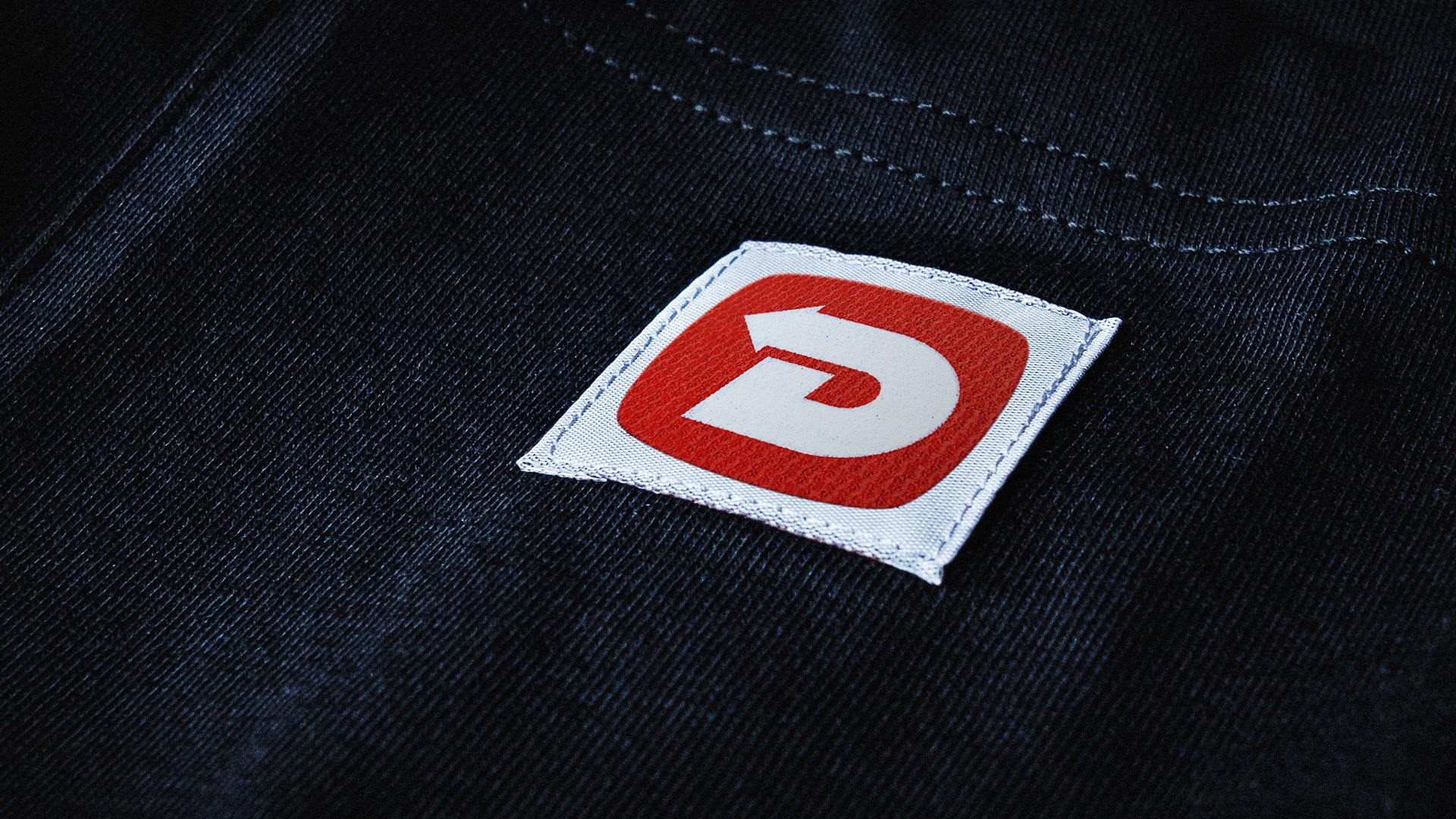
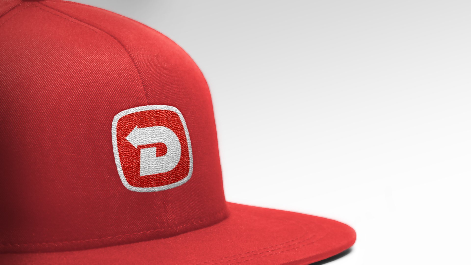
Inspiration for the logo was taken from vintage embroidered patches.
Design
A custom letter “D” icon was crafted to link the name of the business to the visual identity literally, and figuratively, resulting in memorable and attention grabbing mark.
Also, the arrow that’s embedded in the icon reflects attention to detail, and visually communicates the “dynamic” character behind the brand, Kirk.
For the wordmark , a bold and unflinching typeface was chosen to ensure the business name would be clear, concise, and demand attention.
Together, the icon and wordmark cleverly express the core attributes and characteristics of Dynamic Equipment Services while positioning the brand as a business that offers dependable service and expertise for people operating and working closely with heavy equipment.
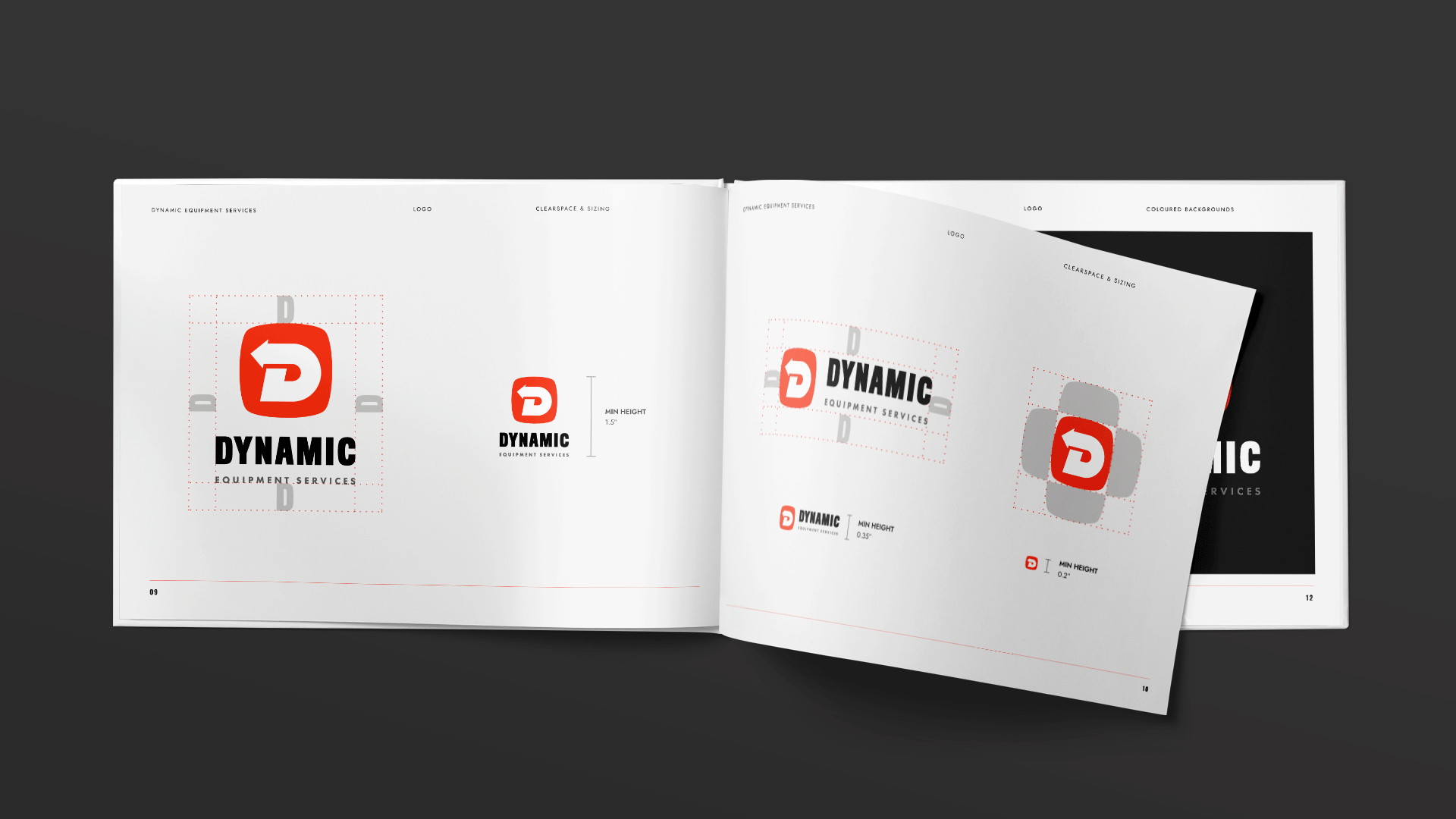
Keeping the many end uses in mind, the logo was designed with three variations to be flexible and responsive for diverse applications at small and large sizes.
The icon for the primary logo was inspired by the badge emblem from the legendary Buick Grand National.

Colour
Kirk was given several colour options, any of which would distinguish his company’s brand from its competitors.
In the end, Pantone Bright Red C was chosen for its energetic warmth and fearless grit.
-
I think the bright orange reminded Kirk of the outlaw spirit of Harley Davidson.


The idea for the philosophy behind the brand was extracted from conversations with Kirk about his business, his goals, and what he valued in his experience on the job.

Typography
For stationery and branded communications, two typefaces were selected for their personality and construction to create the foundation of a visual framework that could be built upon in the future as the brand grows.
Legibility and reading flow were also kept in mind when selecting the appropriate brand typefaces.
Selecting a Google Font instead of purchasing other options would make things easy peasy for Kirk if he or his bookkeeper ever needed to install the brand typefaces on a new computer, since they could download them from anywhere straight from Google.

Results
Ready for Launch
Once Kirk was happy with the designs, he was shipped a complete inventory of logo files.
Included was a one-page brand style sheet that outlined the proper use of the logo, colour palette specs, and information on the brand typefaces.
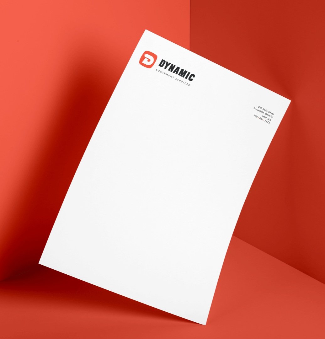
Print-ready business cards and a company letterhead in PDF and Word template format (with styles built into the template) equipped Kirk with the necessaries to get his business running as quickly as possible, and to look smart while maintaining consistency with his brand communications.

Impact
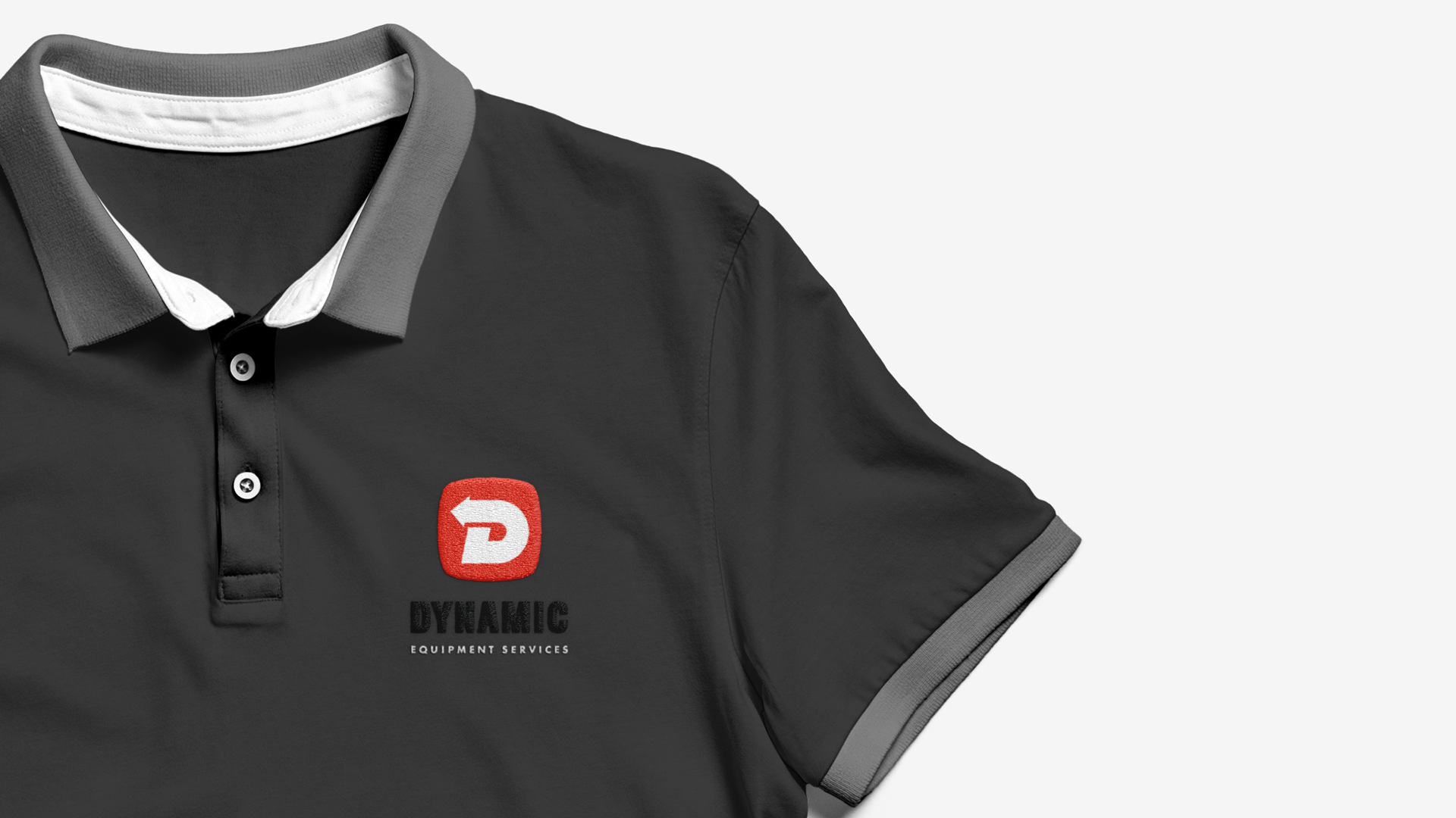
With his new visual identity, Kirk was able to print business cards, get company shirts and sweaters made, and order decals to stick on his mobile service truck and tool boxes.
He was also able to provide his bookkeeper with a stationery set and brand stylesheet so that all his company communications would look smart and consistent.
Since embarking on his journey, Kirk has had so much demand for his services, he can barely keep up — but we think it’s mostly because he’s just such a great guy to be around.


I believe that balancing form and function is key for building a timeless brand.
By starting from a strategic origin and learning about Kirk, his business goals, and his customers, the visual identity was designed to capture the true character of his brand, and a unified and simple system was created to make things easier for Kirk and his small team (of non-designers) to implement.
