McLennan Ross LLP
brand identity, ad campaign, and website for a growing law firm
A visual identity overhaul and launch campaign for a prominent Canadian law firm seeking to define their value to their clients.
-
Project
Brand Identity and Launch CampaignServices
Art Direction , Web Design, Print, Copywriting, User Experience Design, User Interface Design, Web DesignIndustry
LawRoles
Tiffany Smith - Graphic Designer + Web Designer
Other Collaborators: Brand Strategist, Art Director, Project Manager, Web Developer
Note: This project was completed while I was employed by Cubicle Fugitive, a marketing firm for professional services located in Hamilton, Ontario.

Client
About McLennan Ross
McLennan Ross is a premier law firm located in Edmonton, Alberta. At the time, their logo was outdated, and the firm felt that their disconnected visual identity didn’t reflect their professionalism, experience, and dedication to solving tough problems for their clients.
The entire project was exhaustive, and included a completely new visual identity from the ground up, a scroll-stopping launch campaign, brand guidelines, an interactive website, print collateral, and more.
DELIVERABLES
Logo + Identity System
Wireframes
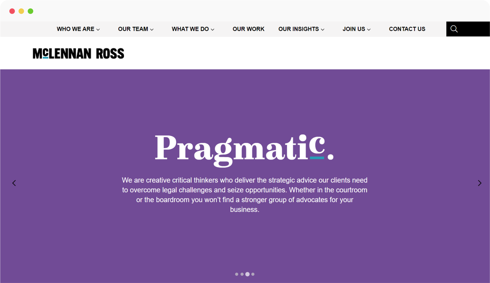
Website Design
Copywriting


Words and concepts drawn from interviews with the client, brand auditing, and research that were synthesized into three pillars to inform the creative strategy.


Early ad campaign and identity explorations.

As part of the creative strategy, we tested several logo concepts to measure how they would stack up next to competitors.
Details
Embodying the spirit of the firm
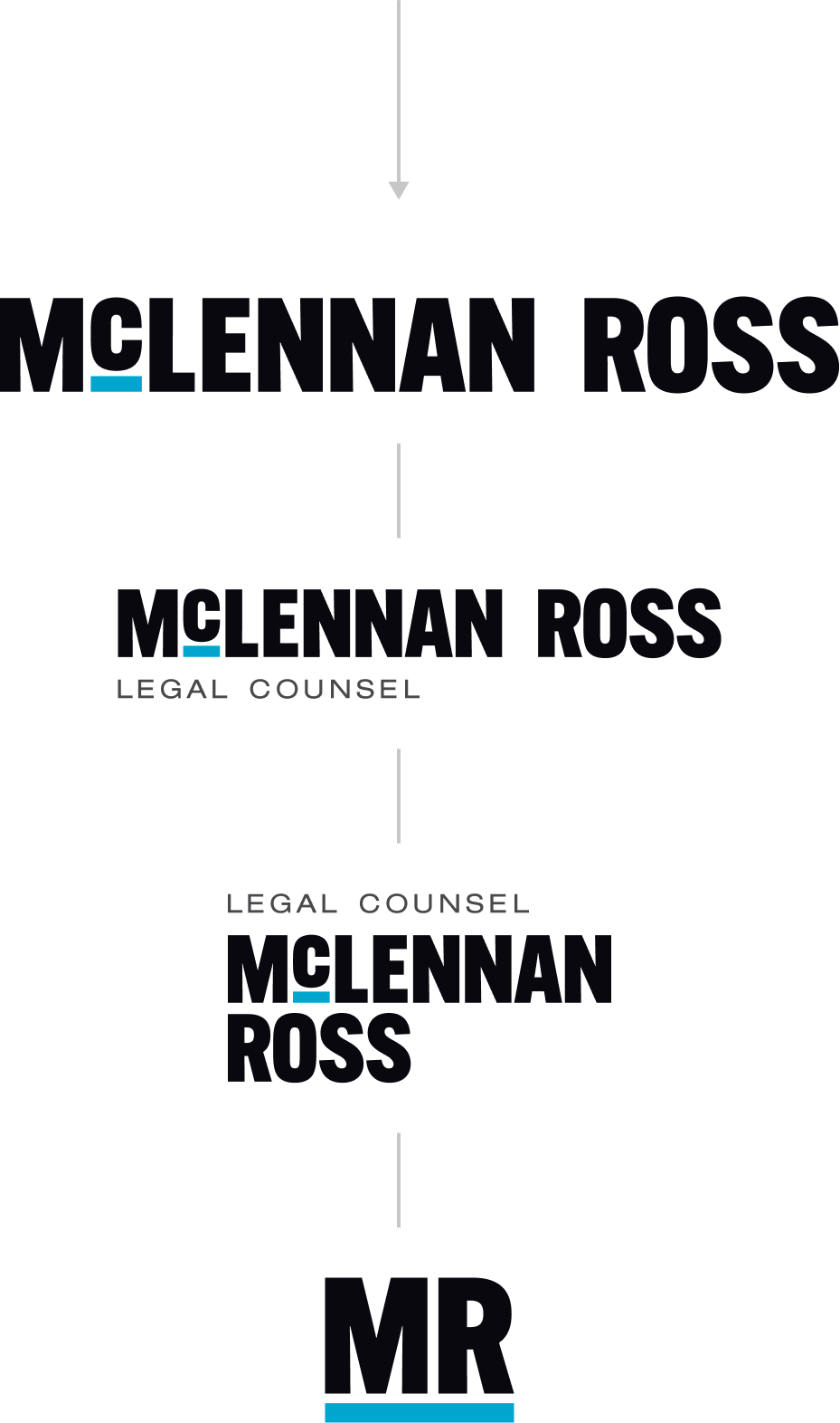
Our goal was to create a visual identity for McLennan Ross LLP that expressed their strength, leadership and resolve, while at the same communicating their passion and fearless advocacy. These ideas led us to choose a hard-hitting typeface that would be easily distinguishable compared to competitor logos and create a lasting impression. The construction of the wordmark includes a symbolic podium for the letter ‘C’ to perch on, reinforcing the firms top-notch status among other law firms and propelling their brand to the forefront. As well, the podium functions as a strategic graphic element that can be integrated across brand collateral and campaigns.


Adding Character through Colour
In our research, we found that law firms typically stick to limited colour palettes, with red and blue being the most common hues. That said, to further add distinction and character to the McLennan Ross LLP brand, we selected a robust colour palette.


